Overview
Isenberg’s 4+1 programs let undergraduates add a business master’s degree in five years instead of six. It’s one of the school’s strongest recruitment tools, but the campaign representing it hadn’t kept pace with the brand. I redesigned it as a modular system: a bus wrap, lawn sign, website takeover, print, and social, all built from the same parts.
The problem
The old campaign was one rigid template, mechanically repeated—the same split composition, copied across every postcard and flyer, four or five years running. Right before the redesign, the only update it got was a photo swap to keep it from looking dated. The design itself never changed: one layout, one typographic voice, nothing tying the pieces together.
The approach
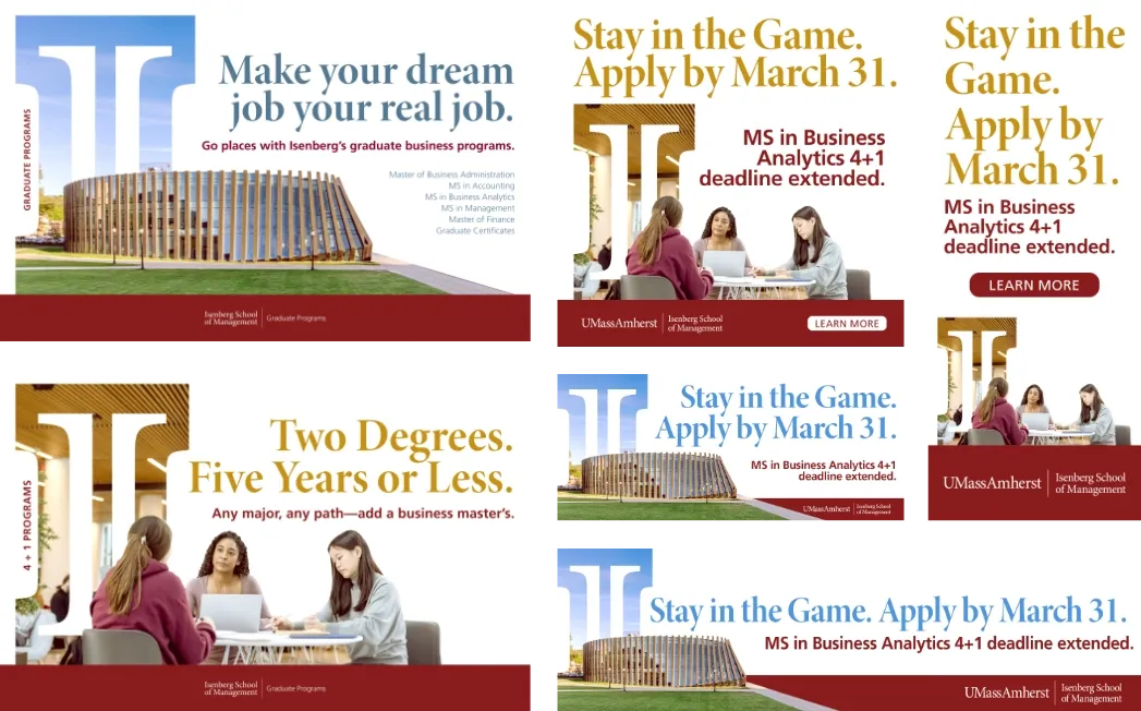
Instead of another version of the same template, I designed the rules—components and a hierarchy flexible enough to hold up from a 2-inch social tile to a 20-foot bus wrap, consistent enough that every touchpoint still reads as one campaign:
- A two-tier type hierarchy. An oversized serif carries the hook; a bold grotesque underneath carries the payload—program, deadline. That pairing repeats at every scale.
- A recurring brand device. The Isenberg icon runs through the system as a cutout window with photography inside it, or as a sidebar tab in print. It’s the one element that survives every format, so even a glance reads as “Isenberg.”
- Flexible photography. A consistent crop and placement logic lets architecture shots or people shots slot into the same layout without a redesign.
- A message layer that flexes independently. Print carries the evergreen line, “Two Degrees. Five Years or Less.” Digital can flex to something timelier—a deadline extension, or “Stay in the Game” for the UMass Athletics site takeover—while staying inside the same system.
In practice
The same components—headline, subhead, photography, the icon, the footer lockup—rearrange across every format: bus wrap and lawn signs out-of-home; interscroller, leaderboard, MREC, and expandable units on desktop and mobile; handouts, table tents, and postcards in print. Nothing here is a scaled-down version of something else—each format is built to its own proportions, using the same logic.
Reflection
A systems problem, not a single-ad problem. The goal wasn’t to make one campaign look better—it was to make it hold together everywhere it needs to exist, without being rebuilt by hand every time.