Overview
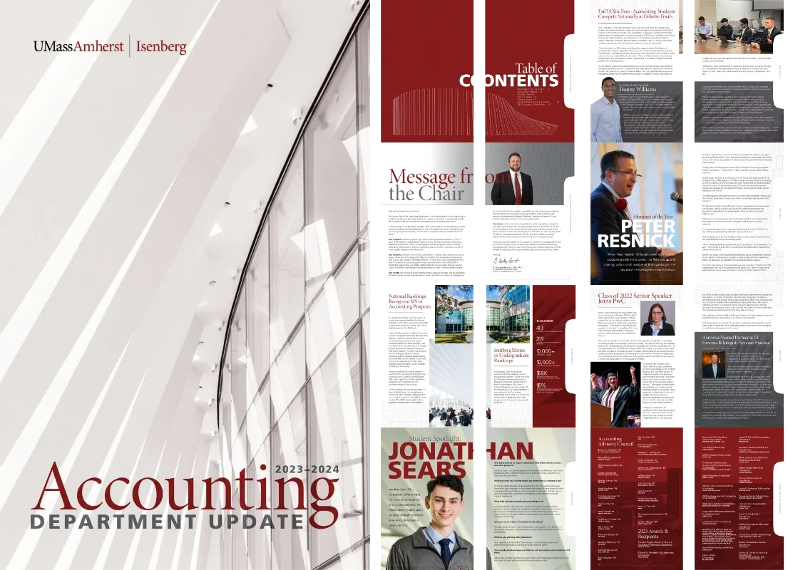
Most of my work at Isenberg lives inside a tightly defined campaign system built for a specific audience and message. This project was the opposite: an annual print newsletter for the Accounting Department, with a full year’s worth of content—a chair’s letter, rankings news, student and alumni profiles, scholarship recipients—and real latitude to design it as a cohesive editorial piece rather than a template. It turned out to be the last year the department mailed a printed version.
The problem
The brief was, in effect, “make this good.” That’s freeing, but it’s also a harder problem than a tightly scoped campaign: there’s no single message to organize around, just a long list of unrelated stories that still need to read as one publication. The content ranged from a formal letter from the department chair to a casual student Q&A, and the design needed to hold all of it together without feeling like a stapled-together packet of separate memos.
My approach
- Building an editorial rhythm. I used oversized, cropped display type on section openers—“Message from the Chair,” “Student News,” “Alumni News”—as a recurring device that gives each section its own moment while keeping the whole book visually consistent.
- Leaning on the existing brand, not fighting it. The maroon field, the Isenberg masthead lockup, the line drawing of the Innovation Hub, and the school’s typography were already established; I worked within that palette rather than introducing a new one, using pattern and photography treatment (like the sepia-toned architectural cover image) to give the issue its own identity within those rules.
- Designing for a mixed reading pattern. Long-form profiles, pull quotes, a numbers-at-a-glance sidebar, and a dense list of scholarship recipients all needed different typographic treatment, so a reader could either sit and read a profile or scan the back pages for names they recognize.
In practice
The finished 20-page booklet was printed and mailed to the department’s alumni network for the 2023–2024 year—the program’s last mailed print edition, with the newsletter has since moved to a different distribution and design.
Reflection
This is the project in my portfolio that shows sustained editorial thinking over a long-form print piece, rather than a single campaign asset. It’s evidence I can take a full year of disparate institutional content and give it a coherent, considered print identity—a different muscle than adapting a defined campaign system, and one that’s directly relevant to the kind of institution-wide print work a university-level design role would ask for.