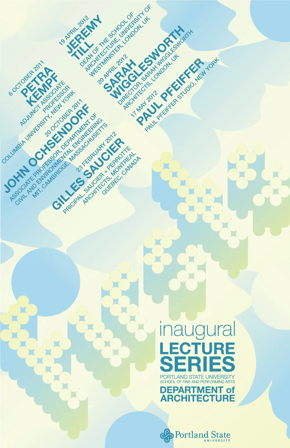
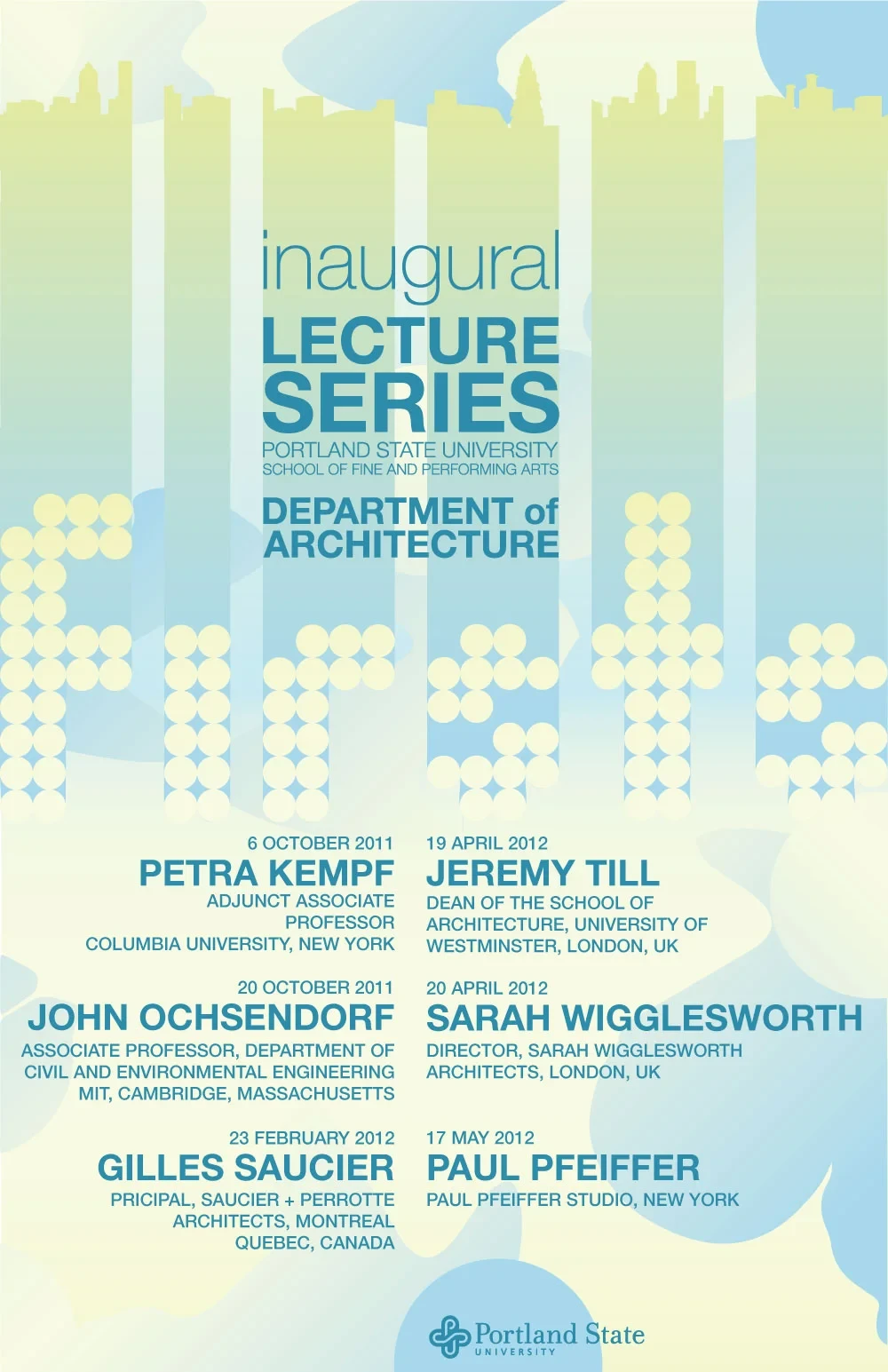
The main poster layout.
Overview
This assignment from my undergraduate Typography course was done in two phases: construct a modular typeface, then design a poster using said typeface.
Repeating a simple circle, I spelled out the name of a fictional architectural lecture series, “Firsts.” I then took this even further, printing and manipulating my typeface to be the basis for every part of the design.
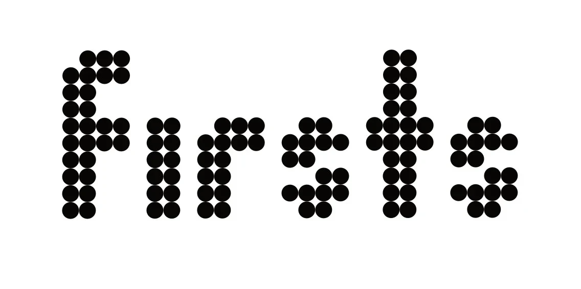
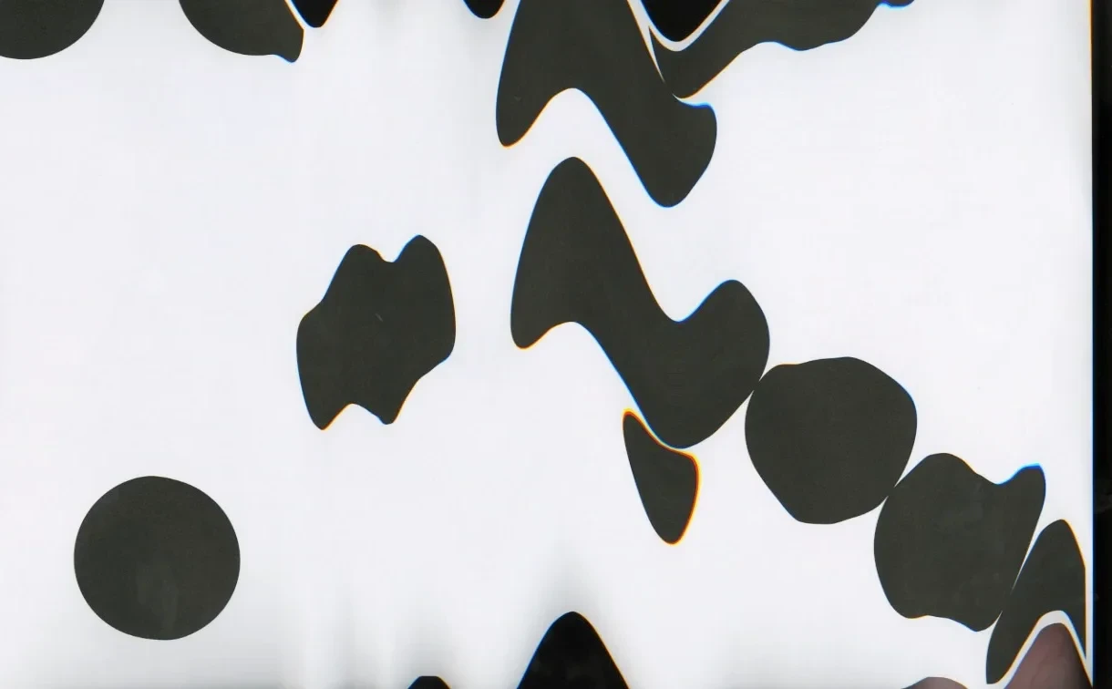
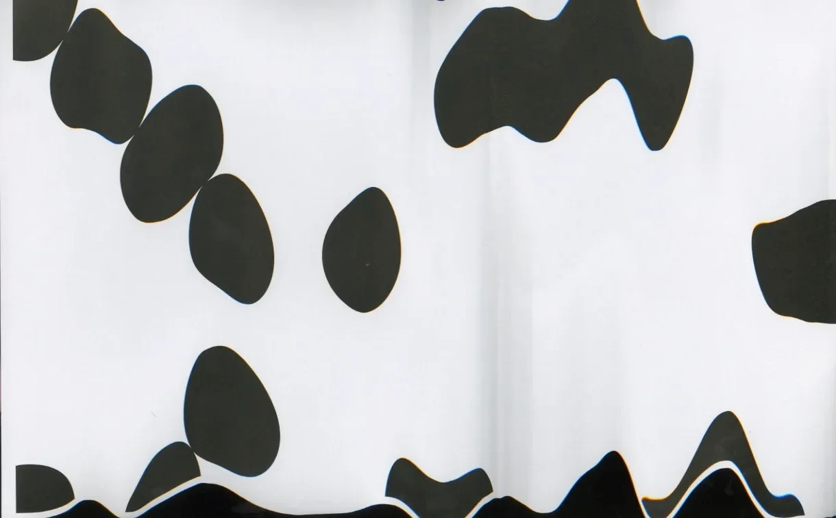
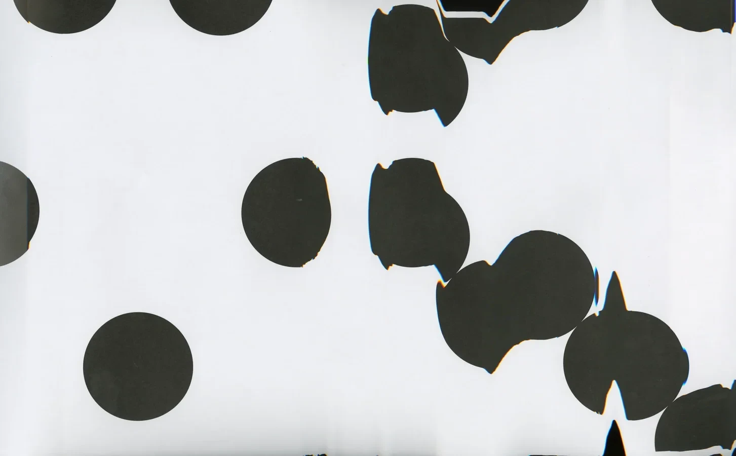
The 'Firsts' modular typeface.
Process
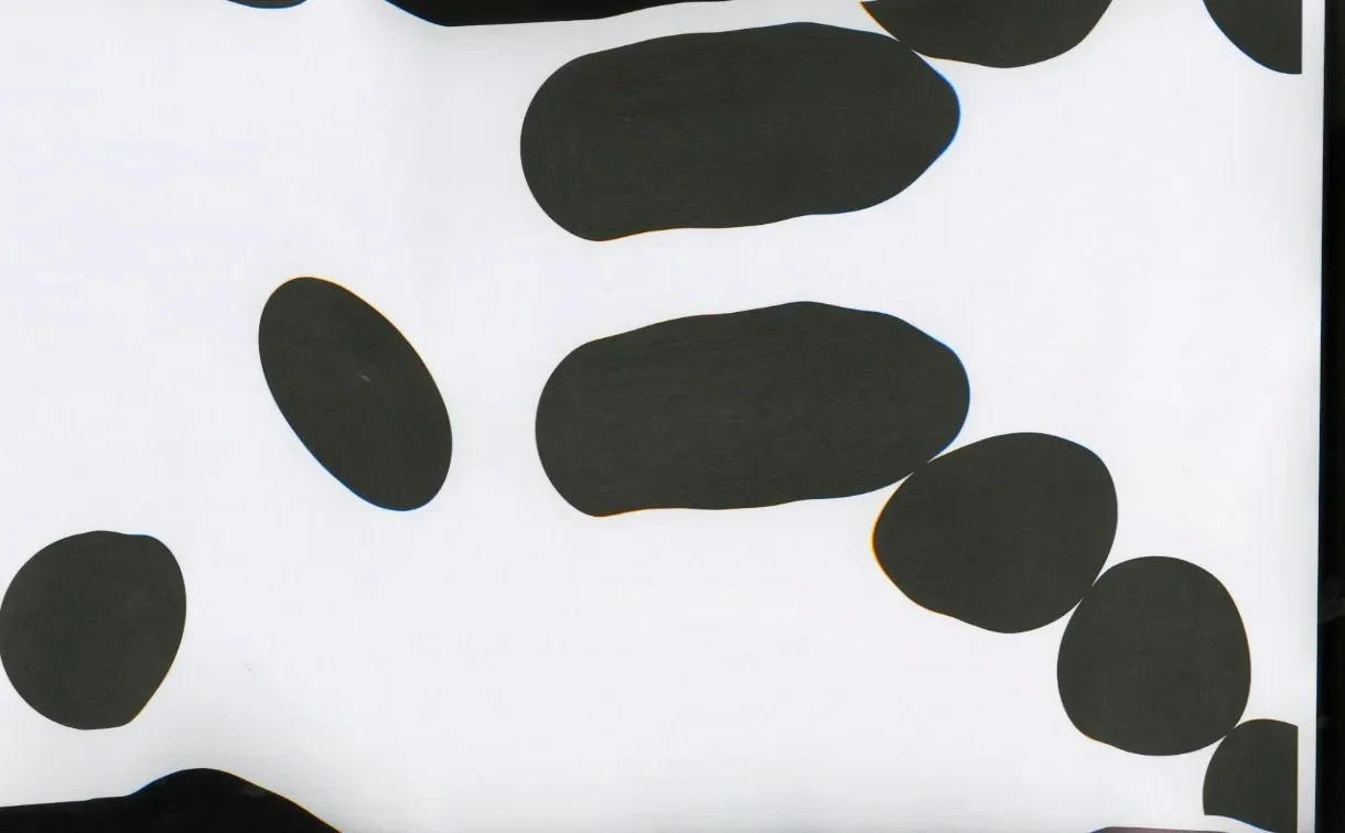
This gallery illustrates some of my process in creating this poster. After designing the typeface, I printed extreme close-ups of the word ‘firsts’ and the dots comprising it, and scanned them back in while moving the page, letting the scanner’s artifacts become part of the texture. Repeating that with more aggressive manipulation mid-scan warped the dots into looser, more organic shapes with creased, distorted edges.
Layered and recolored, those glitch scans became the poster’s background. This way, the typeface can generate its own texture rather than sitting on a separately designed backdrop.
Reflection
This project worked a different muscle than the brand and campaign work elsewhere in my portfolio: type construction from a single shape, and applying a self-made typeface at poster scale rather than just a logo.