Overview
Rankings are a core part of marketing in higher education. For subject-specific rankings like Best MBA or Best Business School, U.S. News simply asks deans at peer institutions to rate schools they’re familiar with. When Isenberg’s ranking started slipping, the fix was one of visibility: staying in front of the people filling out that survey, consistently, over time. I built the entire visual identity for that outreach—postcards, email, LinkedIn—from a blank brief.
The problem
Isenberg had previously only targeted its direct competitive set—UConn, UVM, UMaine. The reasoning was sound: rank yourself against schools you’re actually competing with. But it missed how the survey works. A dean at Harvard isn’t going to rank Isenberg first, but if that dean has never heard of Isenberg, they can’t rank it at all. Expanding outreach to roughly 800 peer institutions, regardless of where they sit in the rankings was the path forward. This meant one thing: this campaign needed to reach a much wider, much more senior audience than anything before—and there was no existing system built to speak to them.
The approach
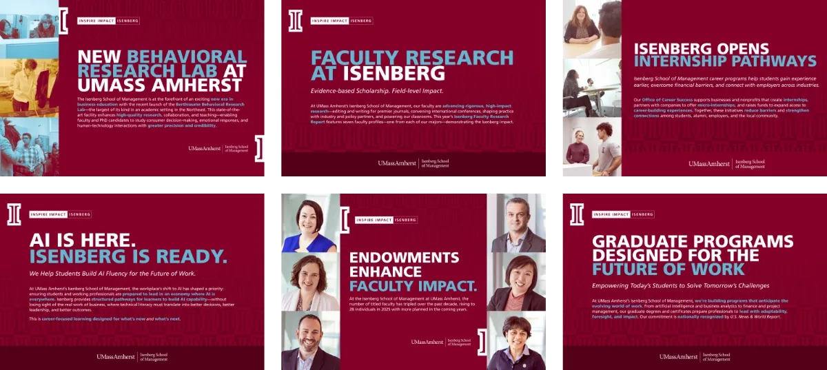
There was no real brief. I decided the identity needed to build on the Isenberg’s 2023 brand campaign and shift the register. This wasn’t built for students scrolling a feed, it was for deans and faculty evaluating a peer. That meant more restraint, more weight, more confidence, and less of the energy necessary for recruitment:
- Leaning into the maroon. Maroon-and-pattern is core to Isenberg’s brand system already, but my recruitment work tends to lead with white space and photography. I leaned all the way into the maroon field instead—denser, quieter, closer to a letterhead than an ad—to match the seriousness of the audience.
- The school’s existing flag, extended. “Inspire Impact Isenberg” is Isenberg’s 2023 brand masthead, not something I invented—but I built it in as a ficture across every piece, so it reads as one consistent series even as the topic changes every month.
- A two-tone headline system. Bold, condensed, all-caps type in white, with a single accent color picking out the key phrase—enough restraint to read as serious, enough contrast to still grab attention in a stack of mail.
In practice
The real test wasn’t any single postcard—it was whether the system could hold across two full academic years of completely different subject matter: faculty endowments one month, a new behavioral research lab the next, career services after that, AI initiatives after that. Each piece uses the same flag, type system, color logic, and icon treatment, so a dean flipping through a year of mail recognizes the series instantly, even though no two topics look alike. The same components carry through email and LinkedIn graphics as well, so the campaign reads as one voice everywhere it shows up.
Reflection
Most of my work adapts an existing system. This one started with nothing—no brief, no precedent, no template to riff on—and had to hold together across a dozen unrelated topics, two full academic years, and three different formats, for an audience with a much higher bar than a prospective student scrolling past an ad.